Data of the Age of Reptiles: Part 2 - Color
Yale Peabody
R
Dinosaurs
Analysis of Zallinger’s use of color in the mural and the differences between geological periods.
Note
Originally published on December 24, 2017. Moved to new website on August 6, 2023 without edits.
Now that I have a few years more experience, it might be a good idea to revisit these ideas soon.
Color
Zallinger’s use of different colors in each of the geological periods depicted in the mural was my motivation for beginning this project. The Carboniferous period, when the earth was covered in swamp forests and the atmosphere had 50% more oxygen, is depicted with vivid greens at the far right end of the painting. Does Zallinger have similar logic behind his depictions of the Permian period, with pink skies and rocks, and his use of greys and blues in the Cretaceous period on the far left?
There are a lot potential questions surrounding the colors, but I’ll start with the easy ones in this post.
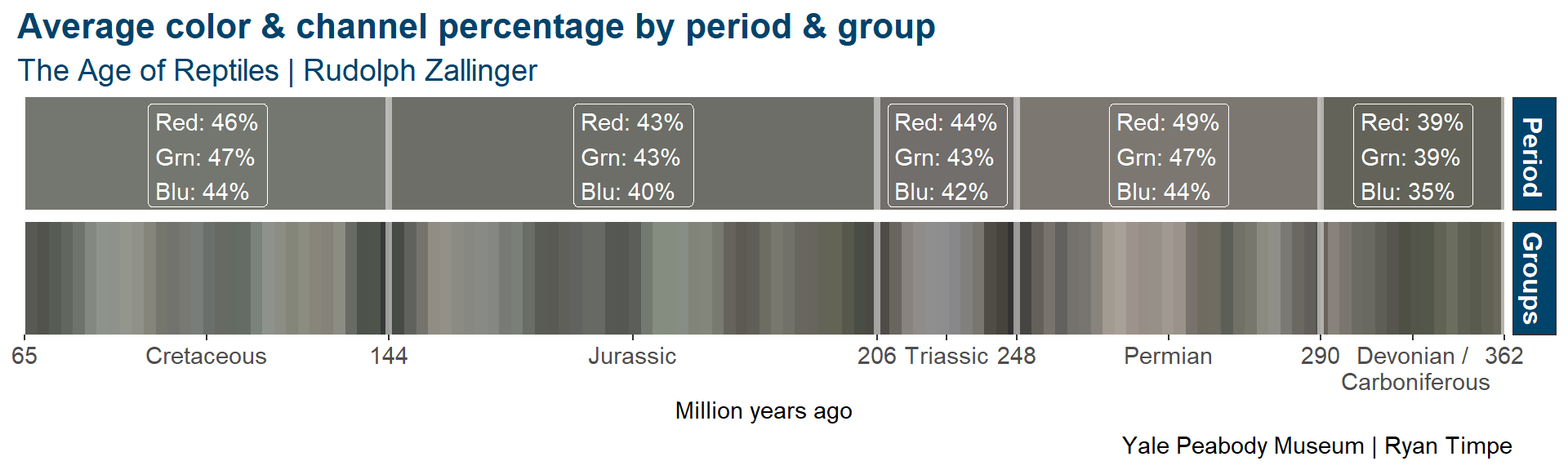
Average color by period
What’s the dominant color in each period? I began by finding the “average” color of each period. I calculated the mean red, blue, and green channel values in each period, and then converted them into a single color. I repeated this for groups of every 10 pixels along the horizontal axis.
This analysis confirms what we can see in the original painting - the Permian period is the most red with a 49% average value, and through the bottom chart, I can see it’s driven primarily from the light skies and rocks in the middle portion of the period.
These shades of gray, however, don’t give much insight into Zallinger’s use of different colors througout the painting. My next step was to plot the R, G, and B channels independently to study the distribution of colors.
Computers treat light and color differently than a painter does - a white pixel has 100% values for each of the three channels, but Zallinger did not use three colors of paint to get a white portion of the painting.
Paint colors in the mural
Rather than treating each color channel independently as color, I mapped each combination of channel values to a named color (Red, Green, Blue, or Gray). These are the colors we see in image and the shades of paint Zallinger used in the mural.
#If a given channel accounts for more than 34% of the light...
#... and is the brightest channel...
#... assign it that color

color_threshold <- 0.34 #high values here will allocate more pixels to "Gray"
aor.color.prop <- aor.colors.1 %>%
  mutate(Rp = R / (R+G+B),
         Gp = G / (R+G+B),
         Bp = B / (R+G+B)) %>%
  mutate(color_name = case_when(
    Rp >= color_threshold & Rp > Gp & Rp > Bp ~ "(B) Red",
    Gp >= color_threshold & Gp > Rp & Gp > Bp ~ "(C) Green",
    Bp >= color_threshold & Bp > Rp & Bp > Gp ~ "(D) Blue",
    TRUE ~ "(A) Gray" #If the 3 channels are similar, the color is a shade of grey
)) | color_name | n | share |
|---|---|---|
| (A) Gray | 33458 | 16 % |
| (B) Red | 67911 | 32.5 % |
| (C) Green | 71541 | 34.3 % |
| (D) Blue | 35840 | 17.2 % |
The resulting table shows use that Zallinger primarily used shades green and red in the mural, and then less so grays and blues.
A more interesting analysis is to actually view the mural filtered by this new information. With each pixel assigned to a single color, I rendered the mural into 4 images, including only the pixels of a single color.
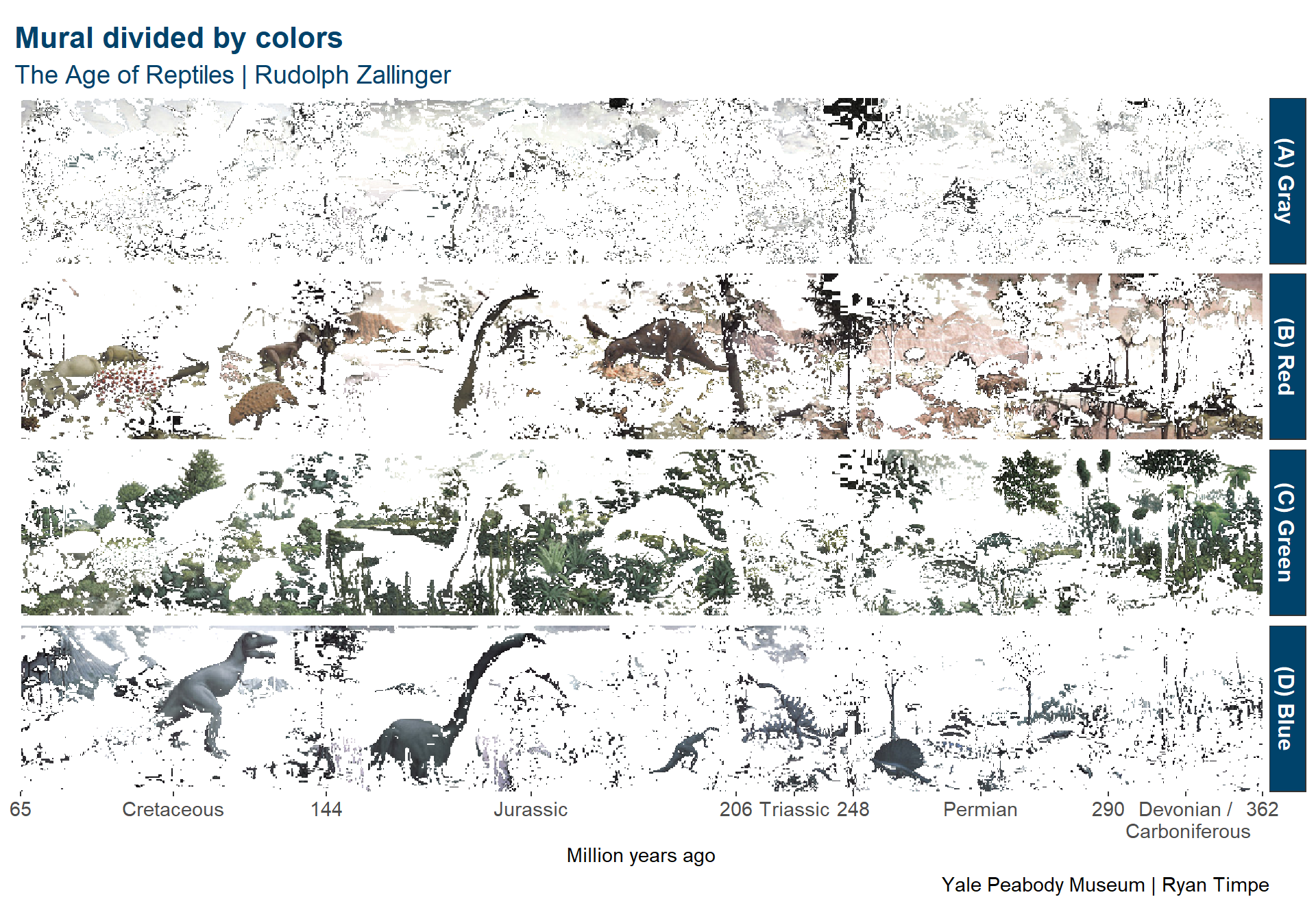
Shades of blue are primarily used for the animals, while the shades of red are used for the remaining dinosaurs and the background. This can also be seen in the negative regions of the green colors.
The shades are green are almost exclusively used for plants, along with a couple of the animals in the Permian period.
Histogram of colors
With a small modification to the data, I collapsed the white space and turned the chart above into a form of histogram to see Zallinger’s distribution of colors throughout the painting. This is also my favorite chart so far in this series.
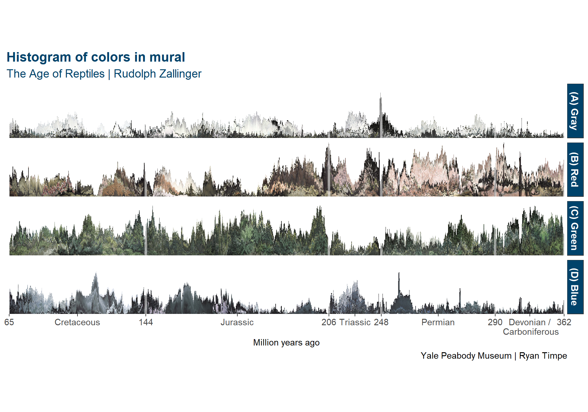
Viewing the data this way provides a slightly more quantitative way to view Zallinger’s use of color over the periods of the painting.
- The shades of red peak during the Triassic and Permian period.
- Greens are used heavily everywhere and the Carboniferous period is almost exclusively green.
- Blue paints are used sparingly, but there are a few areas of heavy use.
- Volcanoes and T.rex in the Cretaceous
- Brontosaurus in the Jurassic
- Plateosaurus in the Triassic
- Edaphosaurus in the Permian
- Shades of grey and white are used consistently over the entire mural.
Another histogram
Finally, I collapsed the four charts into a single histogram, replacing each color with the average value of that color in each of the periods, tying the analysis back to the original gray chart.

In addition to showing proportions of color throughout the mural, this chart also displays the relative brightness of each of the colors.